Infography.in Review: Create Stunning Infographics in Minutes

Hey everybody, we are back with another review! This time we’re checking out Infography.in, an AI infographics tool that’s designed to make your life a whole lot easier. Whether you need infographics from a prompt, a website link, or a blog post, Infography.in has got you covered. If your Pinterest game is as weak as mine was, you’ll definitely want to stick around to see what this can do for you.
Use code SPL10OFF for 10% off!
Jumpstarting My Pinterest with AI Infographics
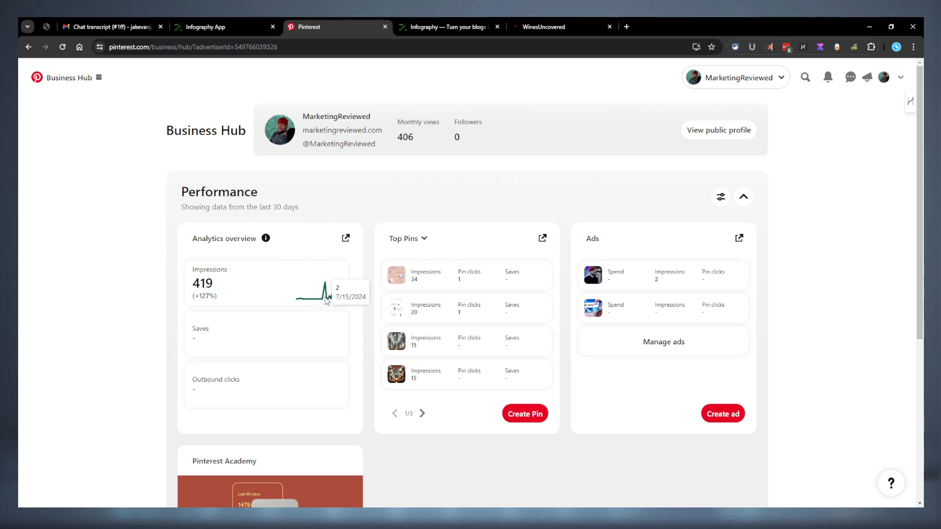
My Pinterest was completely dead, but after posting a few infographics generated by Infography.in, I saw a 127% increase in impressions. Now, considering I had no previous traffic, that’s a huge leap. I posted my first infographic on the 12th, and the very next day, I had 89 impressions, then 173 the following day. It was a drastic and immediate improvement, which is super cool. This positive experience on the trial version convinced me to go back and buy the lifetime deal a few days later.
The Lifetime Deal and Beta Status
Infography.in currently offers a lifetime deal, though it’s still in beta, and that definitely shows. But first, let’s dive into its back end and see what this tool has to offer.
Navigating the Simple Interface
The interface is extremely simple. On the left, you have your home, saved items, and templates. Here’s a quick look at the process:
- Input Options:
- Blog URL: Just enter your blog URL.
- Type: Choose between square and vertical formats.
- Content: Paste your own content if it’s not available on a page.
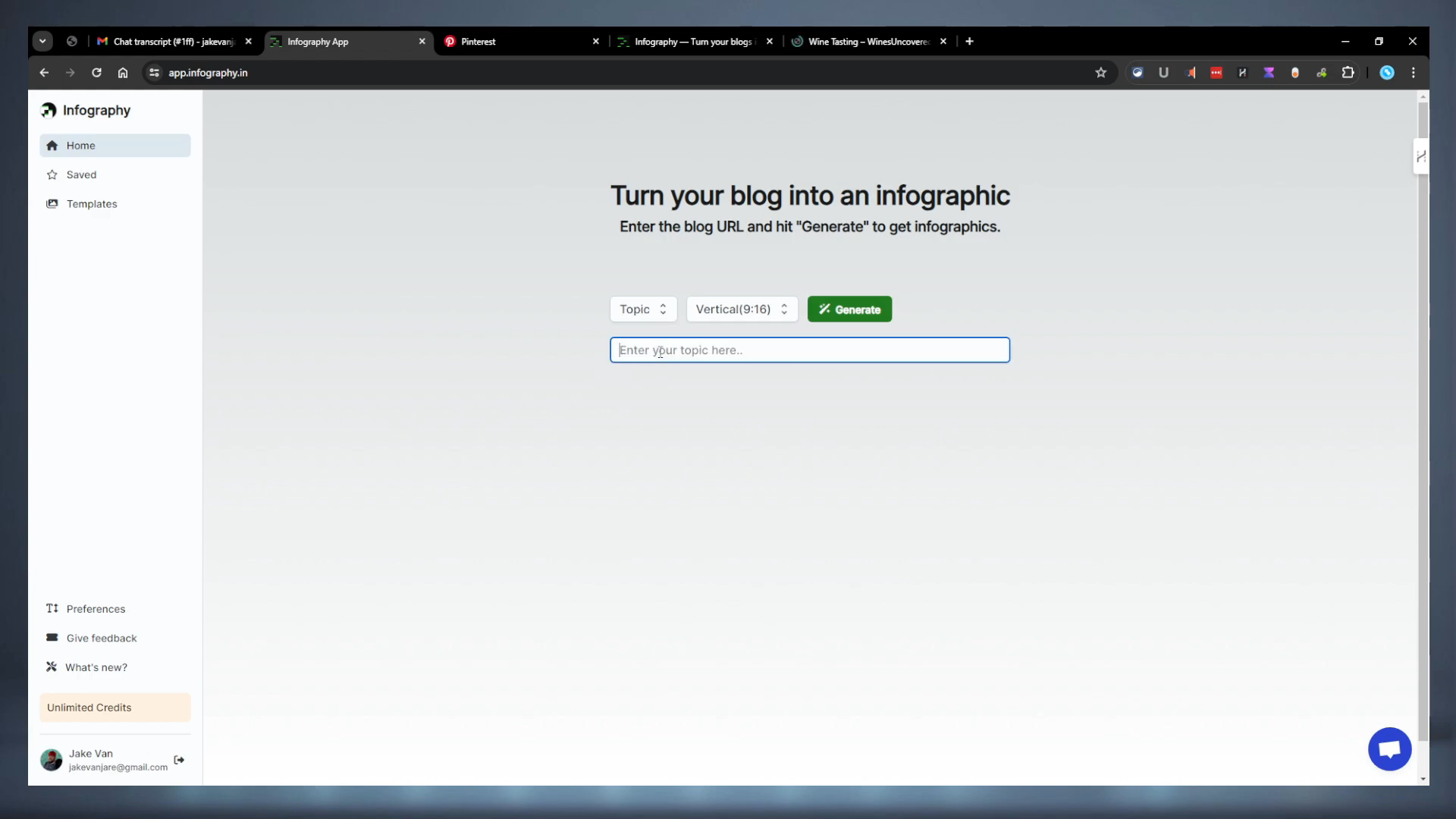
Head over to a blog post, grab its link, and paste it into Infography.in. Let’s try creating a square infographic on wine tasting techniques.
Image Results and Editing
Square Infographics
After generating a square infographic, I found them reasonably good, but there were issues with text overlapping. Here are some key observations:
- Some infographics had too much text, making them hard to read.
- There were instances where text placement needed dynamic control.
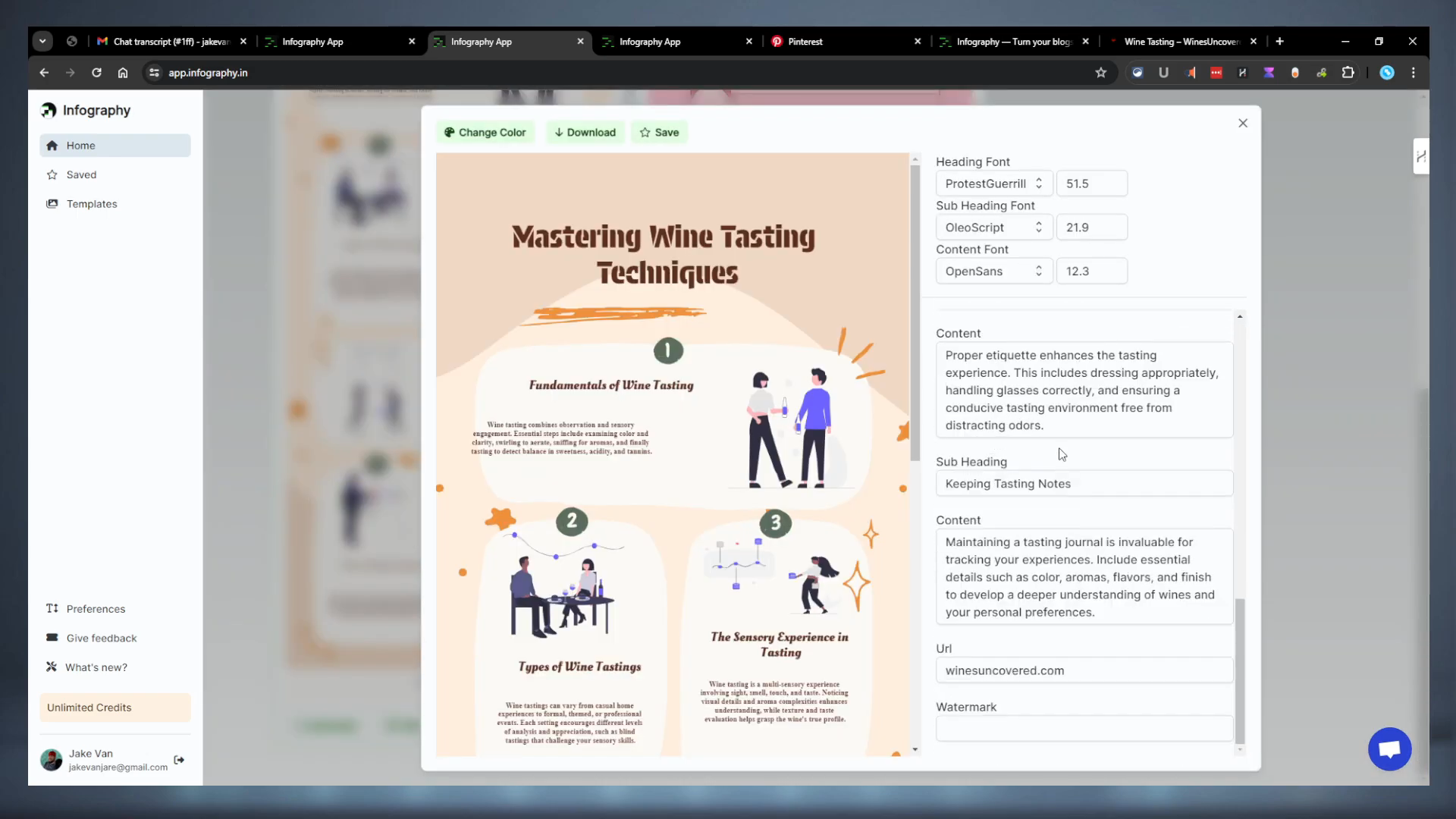
- You can edit these infographics by clicking the edit button, which allows font and size changes, but it lacks the ability to adjust text placement.
Vertical Infographics
The vertical format had similar issues but was generally more reliable. It also allowed some level of customization:
- Change Colors: Click to randomly change the color tone, but you can’t control brand colors.
- Save and Download: Save and download options are present, but saving has some bugs.
- Edit Function: Much like the square infographics, vertical ones also needed better text management.
Creating Infographics from Prompts
Next, I tried generating infographics using a simple topic like “Wine Tasting 101”, both in vertical and square formats.
Vertical Format
The tool delivered a hideous option first but then followed up with three decent ones. The ability to quickly edit, change colors, and adjust fonts was handy, though still somewhat cumbersome for an AI solution.
Square Format Failures
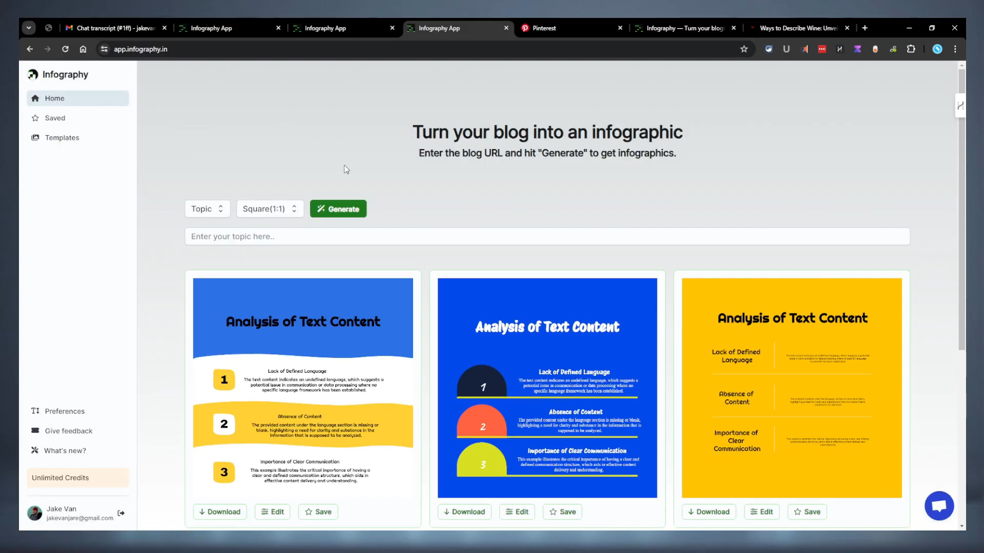
The square format had issues generating results. Even after multiple attempts and refreshes, it seemed like the square topic functionality was mostly broken.
Preferences and Templates
Templates
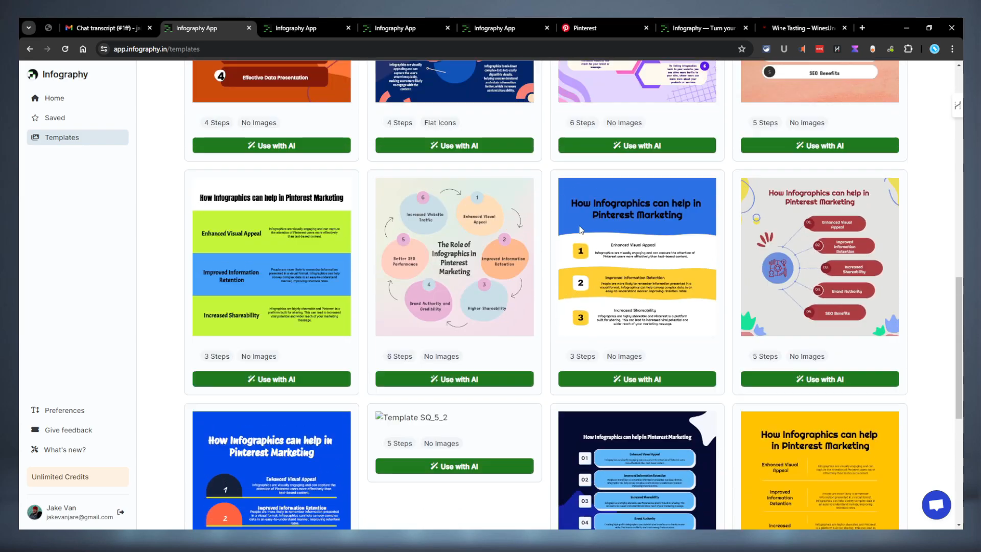
Infography.in offers several templates for both vertical and square infographics. These templates are continually updated:
- Vertical: 27 templates
- Square: 22 templates
Generating Infographics with Templates
Choosing a specific template and generating an infographic is straightforward. However, selecting multiple templates at once would be a nice enhancement. Ideally, pulling brand colors from your website’s color scheme would further optimize the customization process.
Roadmap and Future Features
Current Roadmap
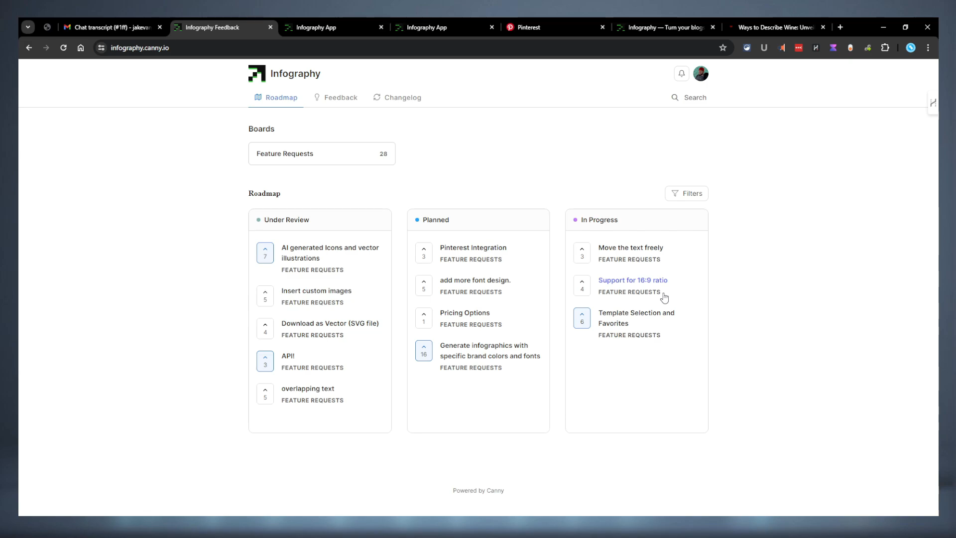
Here’s what’s planned and under review:
- Move Text Freely: Allows better customization of text placement.
- Support for 16:9 Ratio: Uncommon for infographics but adds to flexibility.
- Template Selection and Favorites: Already somewhat present, but more features are desired.
User Requests
- Pinterest Integration: Could boost engagement but has drawbacks.
- More Font Options: Although sufficient, more options never hurt.
- Brand Colors and Fonts: The most requested feature for better brand alignment.
- API Integration: Highly requested for automating processes.
- Fix Overlapping Text: Critical for usability.
Pricing
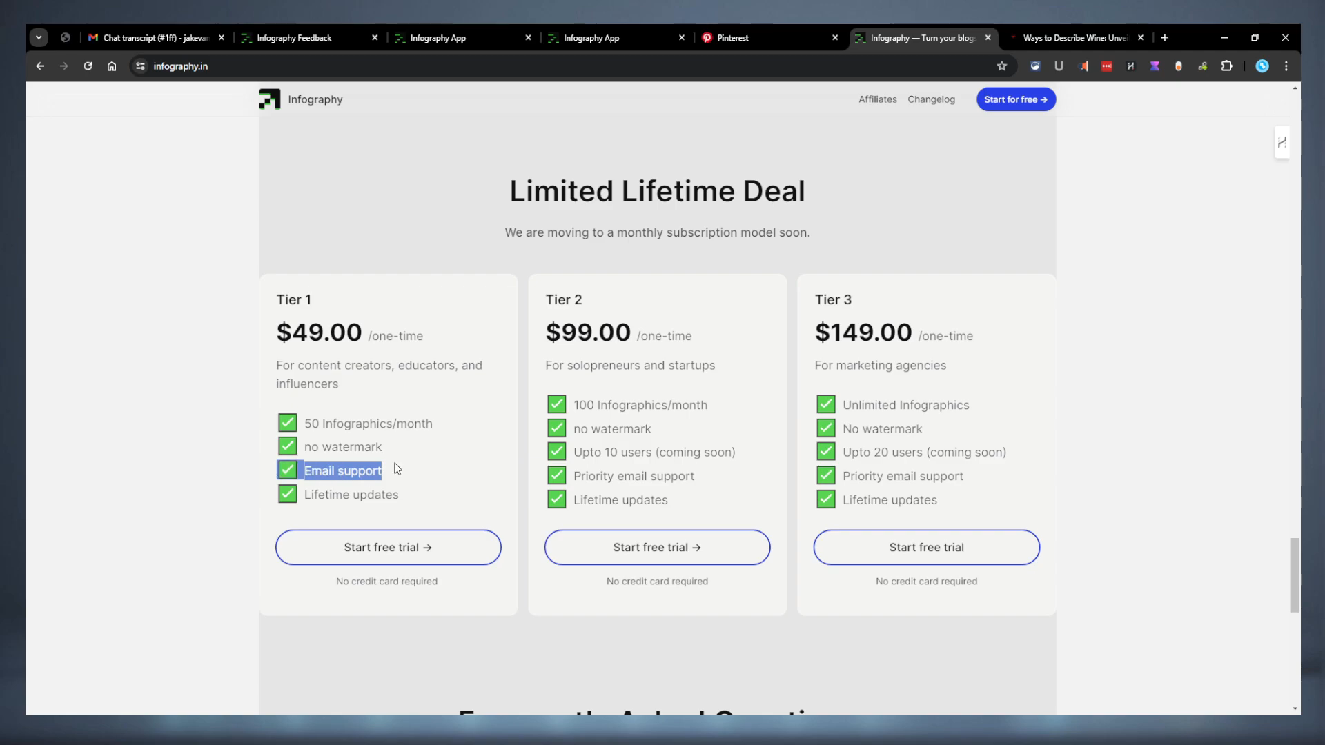
Infography.in is pretty straightforward when it comes to pricing. Here’s a breakdown of the deals:
- Tier One: $50 for 50 infographics per month — suitable for most users.
- Tier Two: $99 for 100 infographics per month — better support but only minor improvements over Tier One.
- Tier Three: $199 for unlimited infographics — the best deal for heavy users.
In each tier, you have 30 days to request a refund, which is ample time to test and decide if the tool meets your needs.
Final Thoughts
Infography.in is simplistic yet powerful, designed for those who want straightforward solutions without being overwhelmed.
“Tools that simplify tasks to such an extent are rare gems. Infography.in is one of them, fitting neatly into your workflow and making content creation a breeze.”
While there are other tools out there, Infography.in stands out for its easy-to-use interface. If you’re keen on shaping its future by contributing feedback, this is the perfect time to get in.
For those interested, use the coupon code SPL10OFF for 10% off the lifetime price. This is a special discount we secured just for you.
Check out Infography.in today and elevate your content game!
Have a great day, and don’t forget to follow our blog for more reviews and digital insights!